Stream Card Builder
Overview
The purpose of this article will be to explain the functionality and processes of, as well as illustrate the usage of, the Akumina Stream Card Builder packaged with the release of Akumina Framework 5.0 featuring the Activity Stream Experience.
Assumptions
The following assumptions are made in this document:
Sharepoint Site with Akumina Framework 5.0 or higher
Project Structure with the latest Akumina Framework NPM Packages
Activity Stream License enabled
What is the Stream Card Builder?
The Stream Card Builder is similar to the Widget Builder and Virtual Page Builder - It automates the scaffolding and structure of Stream Cards to allow end developers to jump straight into designing their User Experience, Functionality, and Connectivity.
First, let's define the idea of a Stream Card:
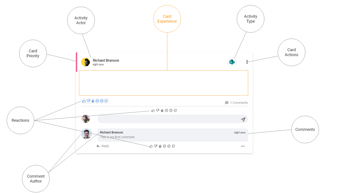
As we can see in the diagram above, the Activity Stream is capable of exposing a variety of data from 3rd parties, Sharepoint, Outlook, and more. The Activity Stream exposes this data through the use of various Stream Cards. Many cards come bundled with the Akumina Installation. However, Akumina also provides end users with the ability to design, create, inject, and connect their own custom cards into the Activity Stream experience.
For more information on Custom Cards, please visit the Custom Card Tutorial page.
Commands
The Stream Card Builder is available via the following NPM Packages:
npm run stub <name>
The stub command starts the process of creating a new Stream Card. The
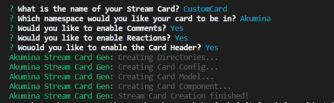
The following prompts are included in the process:
- What is the name of your stream card?
- If applicable
- Default: None
- Which namespace would you like your card to be in?
- Default: Akumina
- Example: Akumina.StreamCards.CustomCard
- Would you like to enable Comments?
- Default: true
- Would you like to enable Reactions?
- Default: true
- Would you like to enable the Card Header?
- Default: true
NOTE: When supplying the name of your new Stream Card, do not suffix the name with "Card". The process will automatically suffix this to your given name. IE - A
The process is similar to the following:
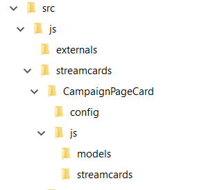
The output structure will be similar to the following:
root
   └src
      └js
        └streamcards
            └CustomCard
                ├config
                |    └config.json
                └js
                  ├models
                  |     └CustomCardModel.ts
                  └streamcards
                        └CustomCard.tsx
npm run package <name>
The package command starts the process of packaging your Stream Card(s) for deploy using the Deploy Tool. The
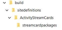
root
   └sitedefinitions
            └assetdirectory (Defined in your .env file)
                    └streamcardpackages
Stream Card Builder Output
The Akumina Custom Stream Card Builder will output three different files: The main TSX file, a model TS file, and the config JSON file. Let's take a look at each piece to understand how they all come together to create our wonderful custom card:
config.json
{
    "Card": {
        "Class": "Akumina.StreamCards.CustomCard",
        "JS": {
            "Default": "/{AssetLibraryName}/DigitalWorkplace/JS/streamcards/digitalworkplace.core.cards.customcard.min.js"
        },
        "Name": "CustomCard",
        "Views": [
            {
                "Name": "Custom Card view",
                "Path": "/{AssetLibraryName}/DigitalWorkplace/Content/Templates/CustomCard/default.html"
            }
        ],
        "EnableComments": true,
        "EnableReactions": true,
        "EnableHeader": true
    }
}
The config.json has a few noticeable changes from the normal widget config.json. The main reason for that is: It's not a widget! The Stream Card is simply a custom sub-component that is injeced into the main Activity Stream widget. The config.json will only hold values relevant to the stream card itself. Those being:
- Class
Similar to Widget config.json, this is the namespace the card javascript will reside in. This lets the Activity Stream Widget know where to find the code as well as tells the Framework where to deposit the code.
- JS
Similar to Widget config.json, this is the location, within Sharepoint, where the physical javascript file resides.
- Name
The name of the Custom Card
- Views
Similar to Widget config.json, this is an array holding the name and path of all the views associated with this component.
- EnableComments
This is a boolean value detailing whether to show the Comments sub-components in the output view.
- EnableReactions
This is a boolean value detailing whether to show the Reactions sub-components in the output view.
- EnableHeader
This is a boolean value detailing whether to show the Header in the output view
Because this is not a widget, the config.json is missing certain sections such as properties, instances, and more.
Model.ts
The Model class is created as part of the scaffolding process to promote good development practices by defining type, structure, and properties pertaining to the shape of the data to be sent to the Custom Card JS.
export class CustomModel {
    constructor() {

    }
}
As you can see, the model class is currently empty as there are no custom properties to define within this component. If we were to have other properties mapped to this component, such as a List Name or a Site Context URL, these would be defined in this class similar to the following:
export class CustomModel {
    public ListName: string;
    public SiteContextUrl: string;

    constructor(listName: string = '', siteContextUrl: string = '') {
        this.ListName = listName;
        this.SiteContextUrl = siteContextUrl;
    }
}
Note: As you can see in the above constructor, we're defaulting values so as not to force us to provide values if we were to create a new instance of this object. This does, however, require the developer to perform certain sanity checks such as undefined/null checks, empty strings, etc. The verbosity of this model is entirely on the end-developer to provide.
Component.tsx
The *Card.tsx class is created as the main entry point and logic driver of the Custom Stream Card. Let's take a look at the default functionality provided by the scaffolding:
import * as React from 'react';
import * as Akumina from 'akumina-core';

import { CustomModel } from '../models/CustomModel';

interface ICustomCardState {
    viewReady: boolean;
}

interface ICustomCardProps {
    ActivityProps: IActivity;
    SubscriptionProps: ISubscriptionProps;
}

export default class CustomCard extends React.Component<ICustomCardProps, ICustomCardState> {

    constructor(props: ICustomCardProps) {
        super(props);

        this.state = {
            viewReady: false
        };
    }

    componentDidUpdate(oldProps: ICustomCardProps, oldState: ICustomCardState) {

    }

    componentDidMount() {
        this.setState({
            viewReady: true
        });
    }

    render() {
        if (this.state.viewReady) {
            return (
                <div>
                    My React Widget!
                </div>
            );
        }
        else return (
            <div>
                Loading Card View...
            </div>
        );
    }
}
There is a lot to unpack in this. So, let's take this function by function:
- Interfaces
We define two interfaces in our React component: IState and IProps. These are used as the structure of the React Component's State and Property properties. These are used in the definition of the React Component during the class declaration.
- constructor
In the constructor, we do typical constructor things: Pass props to the super-constructor as part of the React standard, define your initial state values as part of the React standard, and initialize default values for class-level properties.
- componentDidUpdate
This function is part of the native React Lifecycle. componentDidUpdate fires after the component has updated, whether via state update or forced re-render, and provides the old property and state values to compare against should you need to do so.
Note: For those new to React, it is important to note how React handles instances. Consider the following scenario:
An Activity Stream holds 3 Stream Events, all of type Note. A few minutes pass and a 4th Stream Event enters the Stream. At this time, React operates in a top-down approach. Let's say the cards are rendered in the order of 3-2-1. Now that we have a fourth, React will take the 3rd instance, at the top of the page, and provide it with new properties matching the new event. React will take the 2nd instance and provide it with properties matching the third. React will downshift components, re-purposing them, and create a new instance as the last element. For this reason, it is important to take into account how your components will need to react to new/updated state/property values.
Why does this matter? This matters depending on your functionality. Let's say your Custom Card has a collapse/expand div which is, by default, set to collapsed. Let's say the user expands the div and, following the above scenario, a new event enters the stream. The properties are updated to the new Stream Event but the state has not been reset since this isn't a new instance but a repurposed one. Therefore, the new item in the stream will render with the state of the previously repurposed component - with an expanded div state.
- componentDidMount
This function is part of the native React Lifecycle. componentDidMount is called after the component is rendered to the page, and mounted, for the first time.
- render
This function is part of the native React Lifecycle. render contains the output of the html for this component.
Akumina uses the pageLifeCycleComplete boolean approach to ensure the component is on the page but does not display its contents until it is ready. Instead, displaying transparency to the user that the component is alive and visible but processing in the background to deliver the rich Activity Streams Experience.
There are many more React Lifecycle functions left out of the default scaffolding process. If you need to add more, feel free to do so. The world is your oyster and Akumina is the fishing boat delivering you to safer waters!
The... view?
As you might've noticed, there is no generated html file. The reason for this is simple: React is capable of producing its own output via code. As you might have noticed from the code above, there is no HTML retrieval or processing, simply markup returned as its output which the React Framework will render onto the page.